Our colour preferences are certainly cultural or experience related, but studies have proved that colours influence our psychological functioning and have effect on our mood, feelings and decisions. The study of color as a determinant of human behavior is called Colour psychology.
Though strongly questioned and disputed and despite the fact that personal events, cultural background and memories affect our response to colour, Colour psycology does provide conclusions backed by data and can serve as a valuable tool in the hands of artists, designers and marketers.
So here are some controversial but never the less interesting facts about Colour psycology.
 Yellow
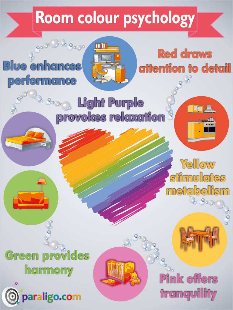
The most visible color, and also the most difficult on the eye.Draws attention, activates memory and promotes concentration.It is happy, optimistic but irritating as well and accused of causing people to lose their tempers and babies to cry. It enhances metabolism, it’s perfect for signs, price tags, and for the walls of your dining room but don’t use it on a nursery.
Green
The most popular color in home décor and the easiest color on the eye. It can improve vision, and reading ability, It is cool, refreshing but also used to visualize negative contexts such as jealousy and sickness. It is soothing, relaxing, antidepressing, it helps alleviate stress and it’s perfect for the walls of a reading nuke, or your living room.
Blue
Equally popular to men and women and one of the most popular colors. It boosts productivity, encourages performance and creates a sense of loyalty, but is also cold and sad. It is calming, peaceful and it suppresses appetite. It’s perfect for a job interview outfit and for the walls of your bedroom or your office.
Purple
The most ancient of all colours and one of the least encountered in nature. It represents royalty and wealth, It’s sophisticated and uplifting but also looks artificial and fake. It is eccentric, it provokes creativity, and gives a sense of peace and comfort. It’s perfect for the walls of your bedroom.
Pink
The most gender related color and probably the most feminine. It’s warm and vibrant, it reduces aggressiveness, it has tranquilizing effects but it also makes you crave sugar. It’s romantic, it encourages friendship, it offers confidence, enhances energy and it has calming effects on children. It’s perfect for the walls of a nursery or children’s room.
Red
The most intense and personally associated color. It’s noticeable, energetic, and helps focusing but is also aggressive, evokes avoidance and can cause poor performance in exams. It’s extreme, it increases heart beat, produces excitement and stimulates appetite. It’s perfect for the walls of a restaurant and your kitchen.
Black
The most minatory of all colors but still one of the most popular. It actually represents total absence of colour, its associated with death and mourning, It’s timeless and powerful, It makes you look thinner but also terrifying and evil. It absorbs light and heat, indicates submission, signifies authority, its sophisticated and its perfect for a formal outfit.
White
The most symbolic color related to goodness and very popular in fashion. It’s associated with freedom, it gives a sense of peace,it can make a room appear bigger but also cold and unfriendly. It reflects light, it’s neutral, clean, and pure, it offers mental clarity and help us overcome obstacles. It’s perfect for summer outfits and the wall of a hallway or a small room.